Using Light and Shade to Bring Text to Life
Light Sources
So before we start the tutorial, here is a little diagram about how light might hit an object. Here we have a square object in the middle with light coming from the top left. You can see that where the light hits the object, a shadow is cast on the other side. Note that the shadow is not a Photoshop drop shadow, which makes the object look like it’s hovering above the canvas. Here we want the object to look like it’s a three dimensional thing stuck on the canvas, extruding if you like. Now tell me what other Photoshop tutorial site gives you diagrams? It’s like being back in school!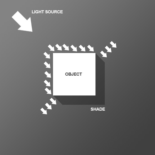
Step 1
We begin the tutorial by drawing a subtle Linear Gradient from dark grey to darker grey. Note that because we want our light to come from the top left, that’s where the lighter part of the document is.
Step 2
Now we place some text. I’ve used a very cool font called Agency FB, which has a condensed, hard-edge feel to it. You should make the text a grey-ish blue color – #c2c8d4 to be precise.
Step 3
Next Ctrl-click the text layer and create a new layer above it. In the new layer, with that selection still held, draw a linear gradient of #495a79 to transparent from bottom right to left. So in other words you are darkening the bottom right as shown.
Step 4
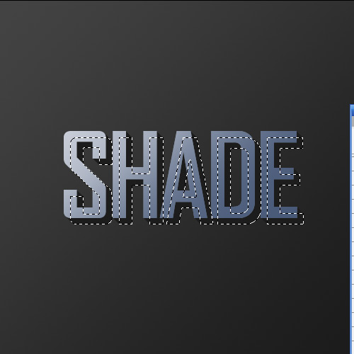
Set your foreground color to Black (you can do this by pressing the letter ‘D’ on your keyboard which restores the defaults).Now Ctrl-click the text layer again and create a new layer beneath the text layer. Now press the down arrow on your keyboard once and the right arrow on your keyboard once. Then press Alt+Backspace to fill it with black. Then press down and right again one time and fill with black. Each time you will be moving 1px right and 1px down. You should repeat this process about 30 times (which is why it’s important to use Alt+Backspace instead of the Fill tool).
Note also that to move the selection but not the fills when you press your arrow keys, you have to have one of the Marquee tools on. If you switch to the Move Tool (V) when you press down and right you will actually move the black fill as well as the selection and will just be filling the same pixels over and over.
Step 5
Here’s what you should now have. Now deselect and make sure you are on the shadow layer, then go to Filter > Blur > Motion Blur and use values of -45 degrees and a distance of 30px.
Step 6
Set your shadow layer to Multiply and about 40% Opacity and then hold down Shift and press the down arrow and then the right arrow. This will move your object right and down 10px each (Shift tells Photoshop to go 10px at a time instead of 1). Now you may have some of the blurred parts of the shadow sticking out to the top and left of the object. If this is the case, grab a small soft eraser and gently erase away anything which shouldn’t be shaded (remember the diagram at the beginning).
Step 7
Next duplicate the shadow layer, hold Shift and move it down and right again. Then run the Motion Blur filter again with a distance of 50px this time and set this layer to Multiply and 20% Opacity. This is just to give our shadows more of a trail off.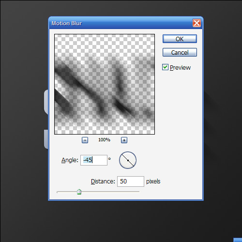
Step 8
Now create a new layer above all the other layers, hold down Ctrl and click the main text layer to select its pixels and back on your new layer fill the selection with White. Don’t let go of the selection just yet though. Instead press down and right one time to move 1px away and then hit Delete.Set this thin white line layer to about 80% Opacity.

Step 9
As you can see, the thin white line gives a sort of highlight effect where the light source is hitting the text and gives the impression that the text is more three dimensional.
Step 10
Next we want to create some streams of natural light. Create a new layer above all the others and draw four or five white rectangles approximately similar to those shown (i.e. getting fatter as they go down).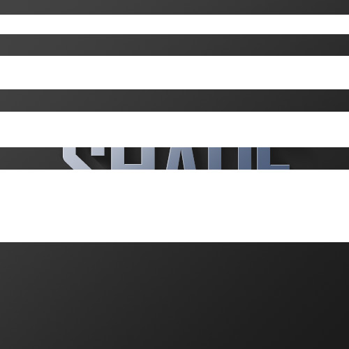
Step 11
Now press Ctrl+T to transform and rotate and enlarge the rectangles as shown. Now normally you’d press Enter when you’re finished, but this time don’t let go just yet. Instead, right-click and you will get a pop up menu showing you other types of transforms you can do. Choose Perspective. The reason it’s important to do this in one step is so that you don’t lose your bounding box. So take the top left two points and bring them closer together so that the light appears to be coming from one place and spreading out.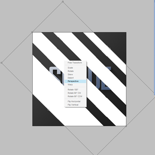
Step 12
Here we have our four strips of "light." Now set the layer to Overlay and 20% Opacity and then go to Filter > Blur > Gaussian Blur and give it a blur radius of 6px.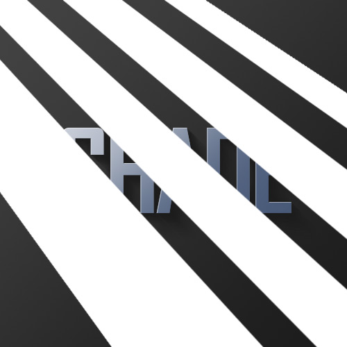
Step 13
You should now have something that looks like this.
Step 14
Now since those thin strips are meant to be light, it would make sense if our highlight layer only showed up where the light was hitting right? So Ctrl-click the light layer and then click on the highlight layer from earlier, then while the selection is still on, click on the Add Layer Mask button (it’s the one at the bottom of the layer palette to the right of the ‘f’ icon). This will create a Mask that only shows the highlight layer where the light overlaps it.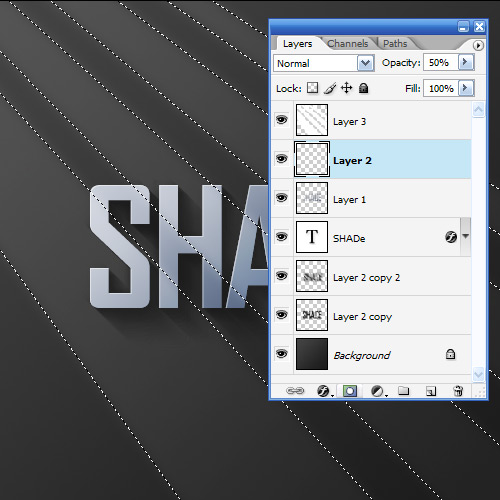
Step 15
So you could stop here; it’s already looking pretty good, but we’ll finish this effect off by adding some warm lighting.
Step 16
So first of all create a new layer just above the background and fill it with a pinkish color – #9d506c.
Step 17
Now set the pink layer’s blending mode to Colour and the opacity to 20%. This gives our background a nice reddish-warmth. Over the top of this we can now mix in some yellows. If we don’t put in the reddish cast underneath, the result comes out looking overly yellow and not particularly real.
Step 18
Next we create a layer just above the pink. Fill it completely with white and then go to Filter > Render > Lighting Effects. I don’t often use Lighting Effects, but it does have one very cool preset called the Two O’clock Spotlight, which you can select by going to Style at the top and looking through the options. You can pretty much use this as default, but for our purposes it helps to extend the ellipse to make it a little longer (i.e. the spotlight is a little further off).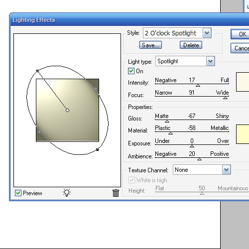
Step 19
Now we set the lighting layer to Overlay and you have something like shown below. Now duplicate that layer, move it above all the other and set it to 40% Opacity. This makes sure that our warm lighting is also interacting with the text and not just the background.
Conclusion
Finally, we duplicate the top lighting layer one more time and set it to 65% Opacity, then click the Add Layer Mask button on the layers palette again and draw a linear white to black gradient from top left to bottom right. This makes the extra lighting layer fade off as it goes down right.
Glossy Emblem Text Effects – Photoshop Tutorial
In this tutorial, we’ll demonstrate how to create the following nice looking Glossy Emblem Text Effect with Adobe Photoshop in 4 simple steps.

With just one text layer and a few layer styles you can have yourself a deliciously glossy emblem text effect in no time. Since the entire effect is done on a vector text layer, you’ll be free to change the font face or letters to suit your needs and still retain all of its styling. As a final touch, we’ll add a simple shadow to give it some perspective and realism.


A closer look at the color ramp for your Gradient Overlay:


And here’s what your stroke’s gradient should look like:


You should now have a beautifully reflective emblem with metal trim. But lets add that last shadow for a little depth.
Congratulations, you’ve created a slick type effect in minutes that’ll compliment your next project and maybe even garner praise from your boss, friends or peers.
With just one text layer and a few layer styles you can have yourself a deliciously glossy emblem text effect in no time. Since the entire effect is done on a vector text layer, you’ll be free to change the font face or letters to suit your needs and still retain all of its styling. As a final touch, we’ll add a simple shadow to give it some perspective and realism.
Recommended Reading: More Photoshop Text Effects!
Step 1
Fire up Photoshop and set your canvas to 800×600. We’ll be using a dark perforated material for the background. This can easily be made by cutting out a pattern of circles from your background and applying a subtle bevel. Feel free to grab the background from the PSD file or use another texture if you wish.Step 2
Next, lay out your type. I’m using black Trajan, 425px in size to cover most of our area. A couple of letters will do for now.Step 3
Now lets slap on a barrage of layer effects. Start off by selecting your text and going to Layer > Layer Style > Drop Shadow and enter in the settings below. Then continue down the list while paying close attention to each setting and blending mode. Also take note of the different contour maps being used. You can find a larger array of contour maps.A closer look at the color ramp for your Gradient Overlay:
And here’s what your stroke’s gradient should look like:
You should now have a beautifully reflective emblem with metal trim. But lets add that last shadow for a little depth.
Step 4
Ctrl (Command for Mac) + click on your text layer’s thumbnail (the white box with the capital ‘T’) in the layer’s palette to select it. Now create a new layer underneath your styled text by pressing Ctrl + Shift + N. Fill this selection with black and Ctrl (Command for Mac) + D to deselect. Apply a Motion Blur filter with a -85 degree angle and 39px of distance. Finally, nudge this layer down a tad so most of the shadow falls below your type.Congratulations, you’ve created a slick type effect in minutes that’ll compliment your next project and maybe even garner praise from your boss, friends or peers.
How to Create 3D Text Blocks in Photoshop
Step 1
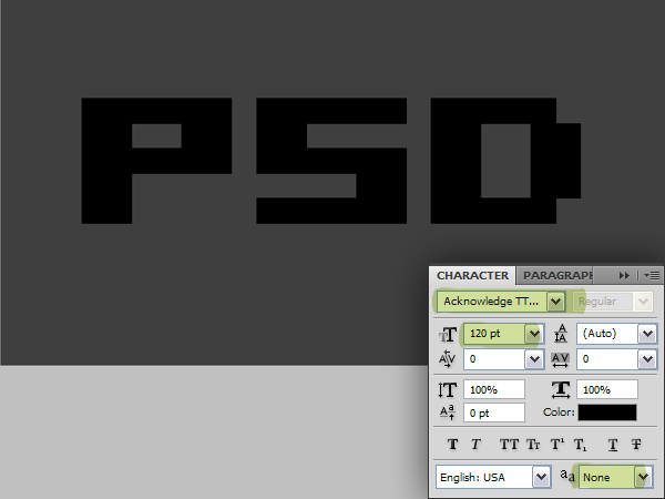
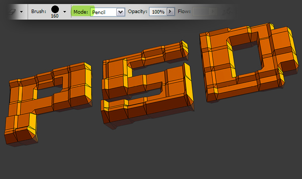
Before we start, you may want to download the font that we’ll use in this tutorial. A bitmap font goes good with this effect so you can use any, or download the font that I used named Acknowledge, from dafont.com.Create a new document 1000 pixels wide and 600 pixels high. Set the Resolution to 300 pixels/inch and set the Color Mode to RGB, named "Blocks." Fill the "Background" layer with color #3a3a3a. Set the Foreground Color to black, grab the Horizontal Type Tool and type "PSD." Set the Font to Acknowledge, set Font Size to 120 pt and set the Anti-aliasing Method to None to achieve rough edges.
Step 2
Create a new layer and name it "Mosaic." Set the Foreground Color to 70% black and Foreground Color to 85% black. Go to Filter > Render > Clouds. Go to Filter > Pixelate > Mosaic, set the Cell Size to 50 and apply.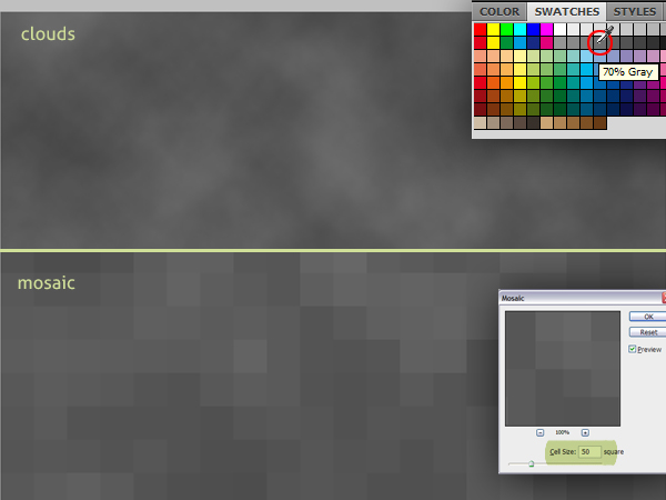
Step 3
Select the "Background" layer in the Layers Palette and hit Command + J to duplicate it. Now Alt-click on the line between the "PSD" and "Mosaic" layers to mask the "Mosaic" layer.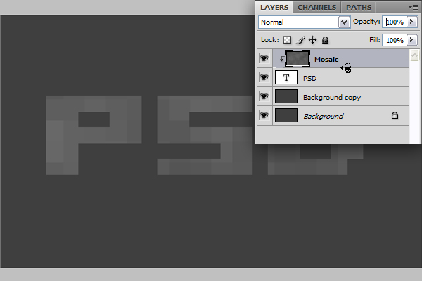
Step 4
In the Layers Palette select all the layers other than the "Background" layer. Go to 3D > New Mesh From Grayscale > Two-sided Plane. Photoshop will create two symmetrical planes and apply the selected layer or layers as a depth map to both planes. That means our mosaic text is now a depth map for the plane, lighter squares will be higher as darker ones will be deeper. The darkest area in our depth map is the "a3a3a3" colored surface and all of the squares are lighter than this color, so there will be no dents but bumps on the surface.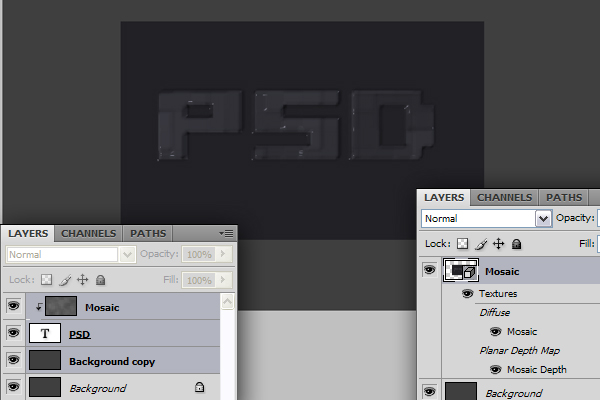
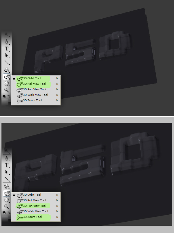
Step 5
Now we have a 3D object and we are viewing it from the front. Actually we are viewing it through the camera but the camera is in the front of the 3D object. You have two options for getting a perspective look. You can rotate the object or change the orientation of the camera. We’ll chose to leave the object where it is because this will help us make the reflection easily later.Get the 3D Orbit Tool and drag to orbit the camera. You can also use the 3D Roll View Tool to rotate the camera. The 3D Orbit Tool orbits the camera in the X or Y direction. The 3D Roll View Tool rotates the camera around the Z-axis. Using these tools try to achieve a perspective as shown below. Then grab the 3D Zoom Tool and drag to zoom in and use the 3D Pan View Tool to move the camera if necessary.
Step 6
There are different rendering presets in Photoshop. The only rendering method that will give us shadows and reflections is the Ray Tracing method. But to achieve the effect we want we are not going to use Ray Tracing. So we have to create the reflection using a trick. This is why we are using a Two-sided Plane instead of a regular one.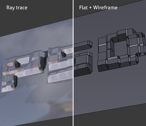
Step 7
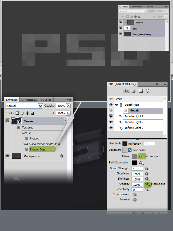
Go to Window > 3D or double-click the 3D Layer Icon in the "Mosiac" layer in the Layers Palette. Select Scene and check Cross Section. This operation will cut the 3D model with the Cross Section Plane and will show the content only on one side of it. The plane is perpendicular to the axis selected. Select the Y-Axis. Thus the bottom side of the Two-sided Plane will become invisible. In order to make the Cross Section Plane invisible as well, uncheck the Plane in the 3D panel.
Step 8
When you create a mesh from a grayscale image, Photoshop uses the grayscale image as a Depth Map. In the Layers Palette when you select the "Mosaic" layer, you can see a Mosaic Depth texture. Double-clicking this material will open the depth map in a new document window. Since you selected three layers to create the mesh, you will be able to see and edit these layer in the opened document.All changes will be updated when you return to the main "Blocks" document window. So if you are not happy with the block structure, you can open the Mosaic Depth texture, go to the "Mosaic" layer, and apply the Clouds and Mosaic filters again as described in Step 2. The depth map is also assigned to the model as a Diffuse and Opacity map. Since we don’t need these textures, we are going to remove them. Select the Mosaic material in the 3D Panel, click the Texture Map Menu icon next to the Diffuse and select Remove Texture. Do the same thing for the Opacity.
Step 9
In the 3D Panel select Scene and click the Render Settings button to bring up the 3D Render Settings dialog box. Set the Face Style to Flat, check Enable Line Rendering checkbox, set the Color to black, set the Edge Style to Constant and set the Crease Threshold to 2, the higher this threshold is, the less the visible edges are. Set the Line Width to 1 and hit OK. In the 3D panel set Anti-Alias to Best for a good anti-aliasing.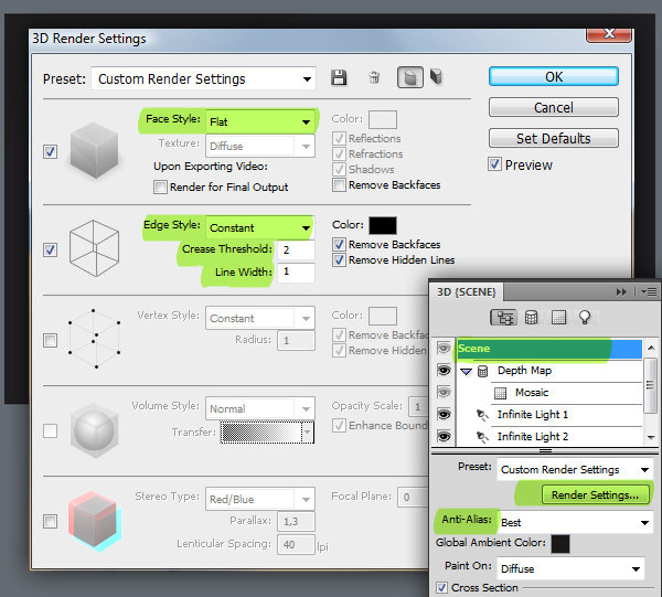
Step 10
Now we’ll change some material settings. Go back to the Mosaic material in the 3D panel, set the Ambient Color to #880022. Set Diffuse to #ee8800. Set Glossiness at 0%. Go to Scene in the 3D Panel and set Global Ambient Color to #575757. Ambient color defines the lightness of the scene when all lights are turned off.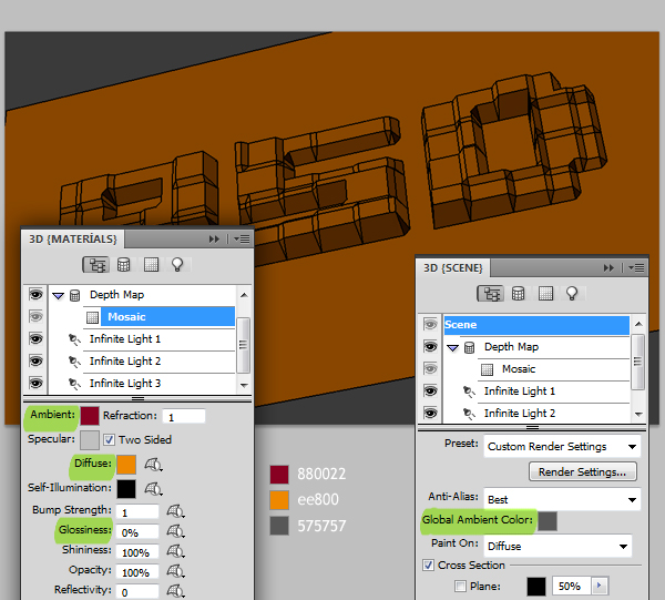
Step 11
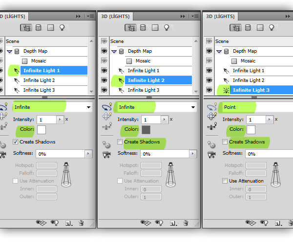
You will see three lights in the 3D Panel. These are the current light sources in the scene. Now we’ll tweak the lights a little. All the lights are Infinite Lights. There are three types of lights in Photoshop. There are Infinite lights, acting like sun and shine from a one directional plane. Point lights shine from all directions just like a light bulb and Spotlights shine in an adjustable cone.Select the Infinite Light 1 and set the Color to white. Select Infinite Light 2, set the color to #696969 and uncheck Create Shadows. Obviously no lights are creating shadows at the moment but when they do, we want only one light to. Select the Infinite Light 3, set the color to white and uncheck Create Shadows and set Light Type to Point.
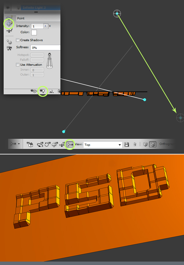
Step 12
The third light is positioned under our plane so we don’t see any effect. To position the light easily we need to change our view, but first, in order to be able to get back to our current view, we need to save it. Get one of the 3D camera tools like the 3D Orbit Tool and click the Save the Current View button and name it “Cam.” Open the View list and select “Top.”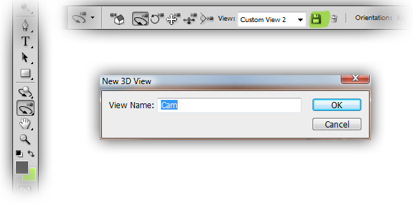
Step 13
Click the Toggle Lights button at the bottom of the 3D Panel to see the lights in the scene. Get the 3D Zoom Tool and zoom out until you see the point light. Click the Drag the Light button in the 3D Panel and position the light as in the below image.Get one of the camera tools, open the View list and choose “Cam” to go back to the camera view. Click the Toggle Lights button to hide the lights. Set the Intensity of the point light to 0.6. You can still drag the light using the Drag the Light and Slide the Light Tools in the 3D Panel.
Step 14
Go to Layers Palette and duplicate the "Mosaic" layer and name it "Line." Go to the 3D Panel, select the Line Illustration preset and hit Render Settings. Set the Line Width to 1 and hit OK.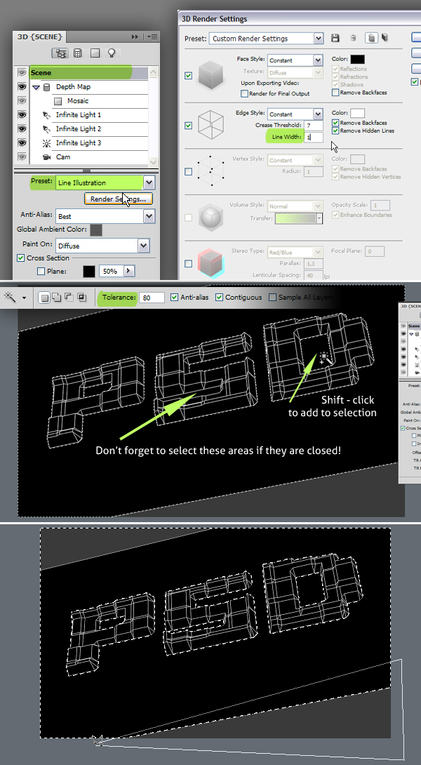
Step 15
Go to the Layers Palette and make the "Line" layer invisible. Go to Select > Inverse to inverse the selection, now the text is selected. Go to the "Mosaic" layer in the Layers Palette. Hit Command + C to copy and hit Command + V to paste the selection into a new layer. Name this layer "Text." Duplicate the "Mosaic" layer and name it "Reflection." Turn off the visibility of the "Mosaic" layer.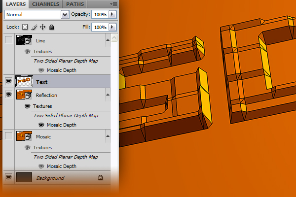
Step 16
Make sure the "Reflection" layer is selected in the Layers Palette and go to the 3D Panel. To get the reflection we need the other half of the Two-Sided Plane. Select Scene in the 3D Panel. Click on the Flip Cross Section button to make the other half visible. Select the Mosaic Material in the 3d Plane and uncheck Two Sided. This will make the back faces invisible and only the reflection will be left.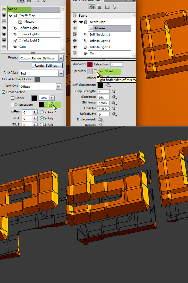
Step 17
The only problem we have with the reflection is that it is quite far away. We need to snap it to the text but making this from the camera view would be a difficult task. Now turn layer visibility off for the "Text" layer and on for the"Mosaic." This can look weird, move the "Reflection" layer below the "Mosaic" layer in the Layers Palette.Now get any camera tool and from the View list select Right and do it for both "Mosaic" and "Reflection" layers. Now you will be able to see both planes from the right view and you can see how far they are from each other. Zoom into the planes using the standard Zoom Tool in the Toolbox, get the 3D Pan Tool, make sure the "Reflection" layer is selected and drag the plane on the left, while holding down the Shift key to the right as in the image below.
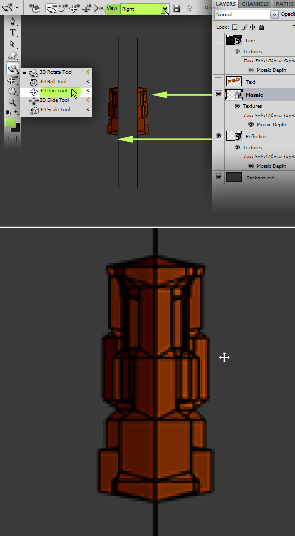
Step 18
Now get any camera tool again and for both "Mosaic" and Reflection" layers go back to Cam view. Turn the visibility off for the "Mosaic" layer and on for the "Text."In order to clean the lines in the "Reflection" layer we need to rasterize it first. Select the "Reflection" layer in the Layers Palette, go to 3D > Rasterize. Get the Eraser Tool, set the Mode to Pencil to avoid any softness and accidentally erasing any parts of the reflection, clean the edges of the plane. Set the layer Opacity for the "Reflection" layer at 45%.
Step 19
We’ll now create the shadow. Go to the Layers Palette, turn visibility on for the "Mosaic" layer, duplicate the "Mosaic" layer and name it "Shadow." Move the "Shadow" layer above the "Text" layer in the Layers Palette.Go to the 3D Panel and select Scene, Set rendering Preset to Ray Traced. Select the Mosaic material in the 3D Panel and set Ambient to black and Diffuse to white. Select Infinite Light 1 and set Intensity to 4. Turn Infinite Light 3 off. Go to 3D > Rasterize.
Step 20
Set the blending mode to Multiply for the "Shadow" layer and set Layer Opacity at 90%. We have quite sharp blocks, but the ray traced shadows make it look smooth. To get rid of these smooth corners we’ll need a little help from the "Line" layer. Select the "Line" layer, make it visible, go to 3D > Rasterize and turn the layer visible off again.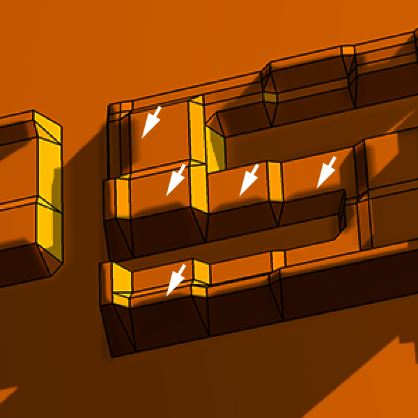
Step 21
Get the Magic Wand Tool and set the Tolerance to 60. Make sure the "Line" layer is selected in the Layers Palette. Zoom in to the letter "P." Click inside the top-left cell of the letter block, although the "Line" layer is invisible the cell will be selected. Then while holding the Shift key, click other cells which are lightened and don’t have shadows on them.After selecting the cells on the top row as in the below image, go to the "Shadow" layer, set the Foreground Color to white and fill the selection by hitting Alt + Backspace. Remember to make the selections on the "Line" layer and to fill the selection on the "Shadow" layer. Since we used a Clouds filter, which generates clouds randomly to make the blocks, your letters probably would not look like mine. But the idea is the same.
Step 22
Go back to the "Lines" layer. Using the Magic Wand Tool select the cells that have to be flat shaded and fill the selection with the color #4e4e4e on the "Shadow" layer.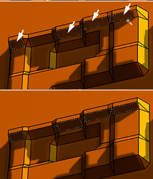
Step 23
Completely lightened and completely shaded cells would be quite easy to fix. Fixing the cells that have shadows would take a little bit longer. Again go to the "Lines" layer and select a cell with shadow on it using the Magic Wand Tool. Get the Polygonal Lasso Tool, and while holding down the Alt key, select the shadow to subtract from the selection. Go to the "Shadow" layer and fill the selection with white.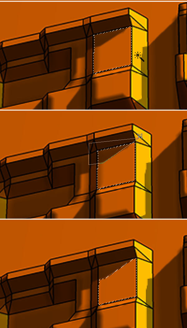
Step 24
Now you have to repeat these three steps for the rest of the cells for a sharp look.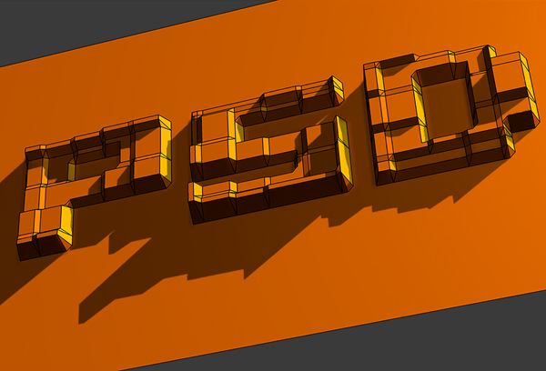
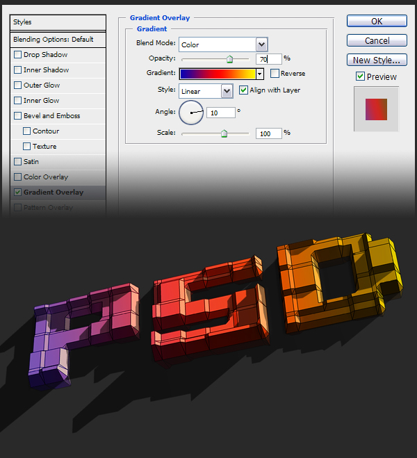
Step 25
Make the "Mosaic" layer invisible. Go to the "Text" layer and apply a Gradient Overlay using these settings: Blend Mode of Color, Opacity set at 70%, Gradient set to Blue, Red, Yellow, with a Style of Linear and Angle set to 10 degrees.Go to Layer > Layer Style > Copy Layer Style. Go to the "Reflection" layer in the Layers Palette, then go to Layer > Layer Style > Paste Layer Style. Set the Blending Mode to Hard Light and Opacity at 35% for the "Reflection" layer.
Step 26
Now we’ll add a slight texture. Download this nice photo from Flickr by clicking here. Bring it in as a new layer into your document and name this layer "Texture." Place the "Texture" layer above the "Text" layer. Alt-click the line between the "Texture" and the "Text" layers to mask the texture. Set the Layer Blending Mode to Overlay.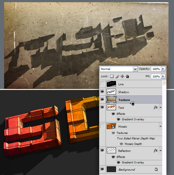
Step 27
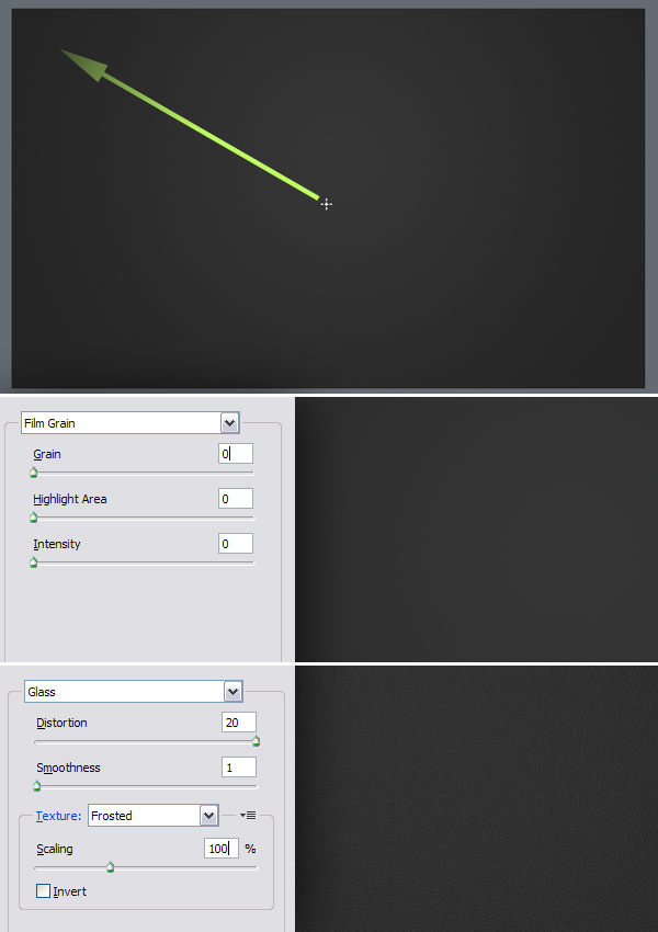
We’ll now make a texture for the background. Create a new layer on top and name it "Bg." Set the Foreground Color to 85% Gray and Background Color to 90% Gray. Get the Gradient Tool, set it to Foreground to Background and set to Radial. Fill the layer as in the below image.Go to Filter > Artistic > Film Grain and apply with all parameters set to 0. Go to Filter > Distort > Glass and apply with these settings: Distortion set to 20, Smoothness set to 1, Texture set to Frosted and Scaling set to 100%.
Conclusion
Get the "Bg" layer above the "Background" layer and that’s it. I hope you enjoyed this tutorial and you’re happy with your result!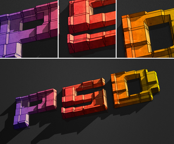
Further Suggestions
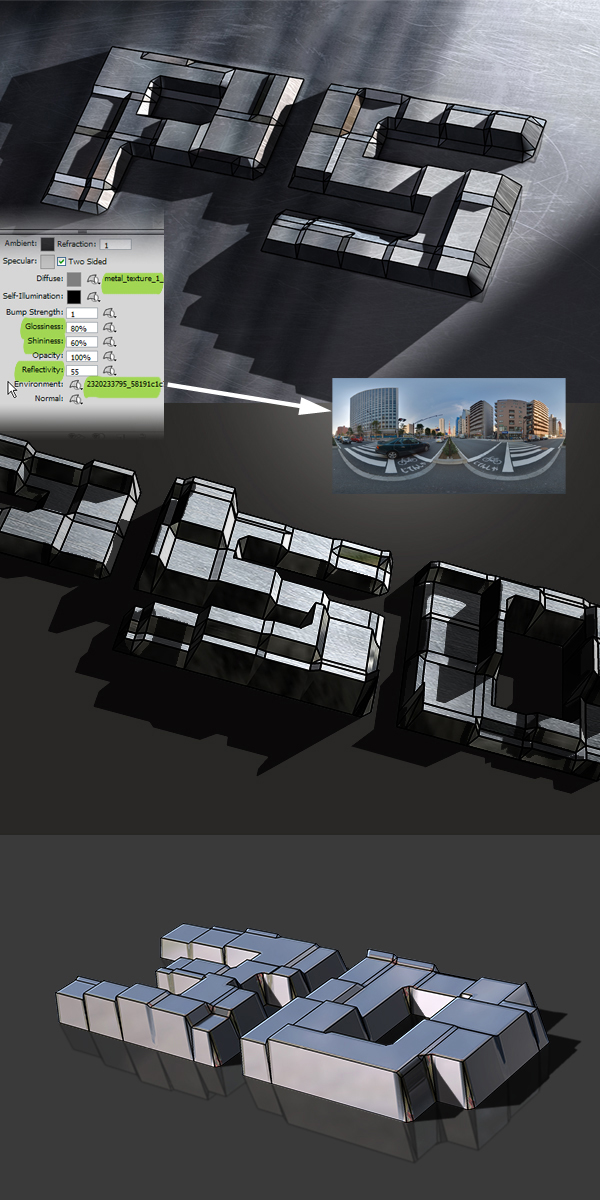
You can achieve cool effects playing with the textures and parameters. You can use texture maps instead of solid Diffuse colors, tweak the Glossiness and Shininess values and use reflecting Environment textures maps. Different light types, colors and angles will create different effects. Have fun with it!